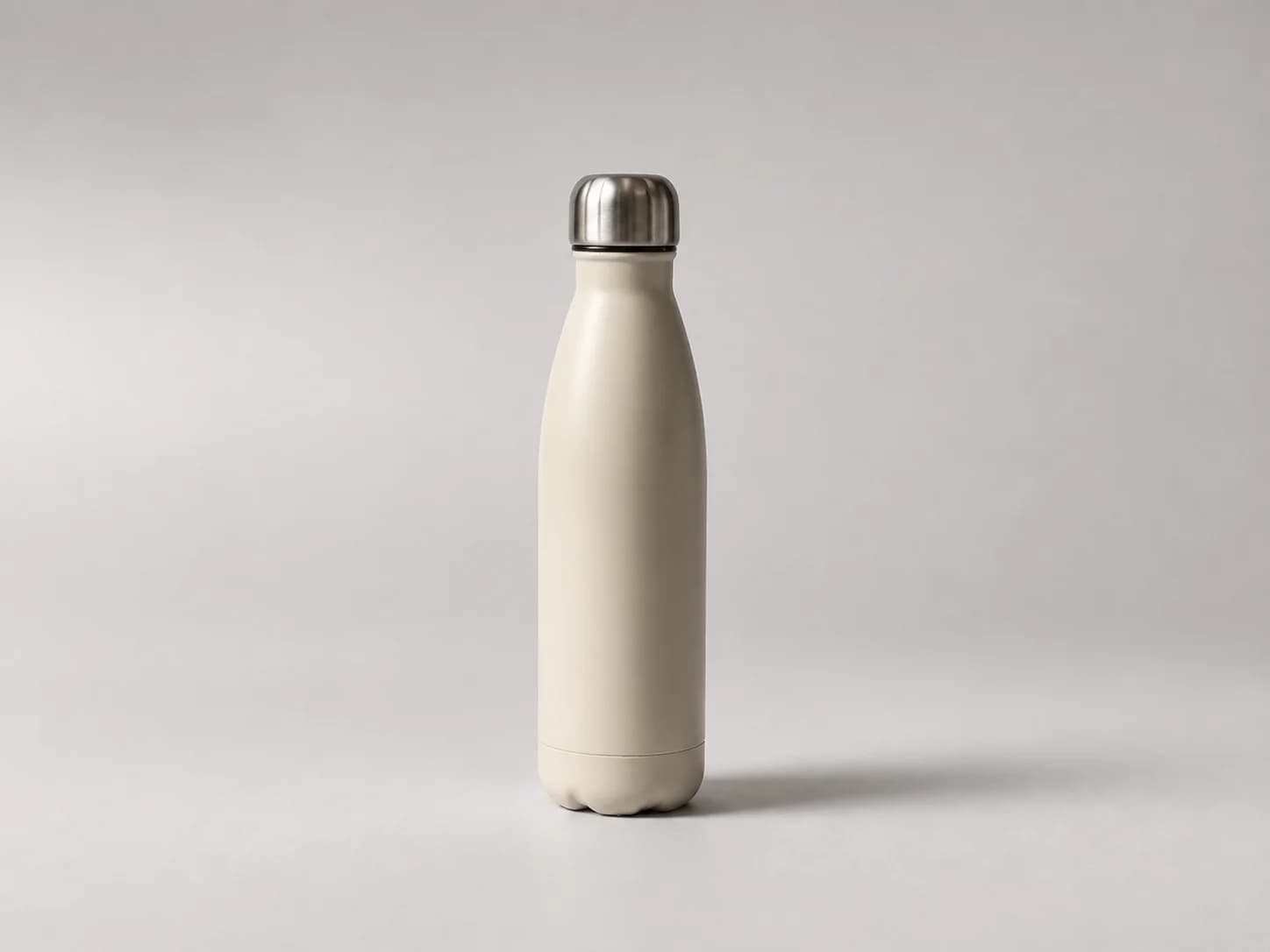
 Packshot
Clean studio
A neutral image for catalogs, marketplaces and clean product pages.
The kit owns color, type, spacing and component rules. Collections give your agent optional ways to make imagery, render the interface and communicate the product without replacing that system. When two directions fight each other, the agent can explain the tension before applying either one.
One example setup
The Design Kit sets the visual system. The other choices tell the agent what to make and how to present it.
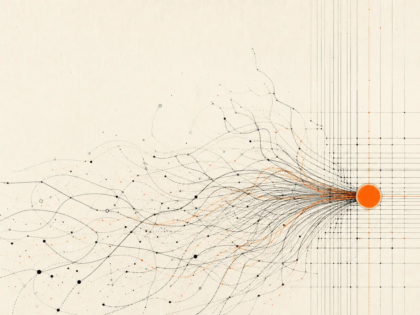
Image direction
Generative linework
ambientsage.com
Ambient Sage
A complete, agent-ready design system in your brand.
An uploaded product and a blank content brief need different instructions. Product scenes keep the item intact and change its surroundings, while the supplied subject remains recognizable. Editorial artwork starts from an idea and creates something new.
Explore image workAgent handoff
Use the supplied product as a locked reference. Preserve its shape, materials, proportions and markings. Explore the set, light, camera, crop and supporting objects. For editorial artwork, work from the content brief instead.
The Design Kit still controls: brand colors, typography, spacing, interface treatment and layout.
Supplied product
Use the approved product photo in a reference-preserving image editor. Keep the product exact while the set, light, camera, crop and supporting objects change.
Browse product-ready directionsPackshotA neutral image for catalogs, marketplaces and clean product pages.
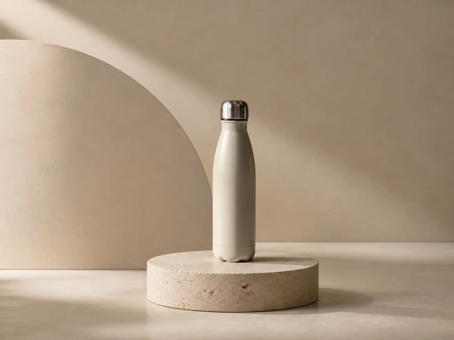 Pedestal set
Add depth and structure without competing with the item.
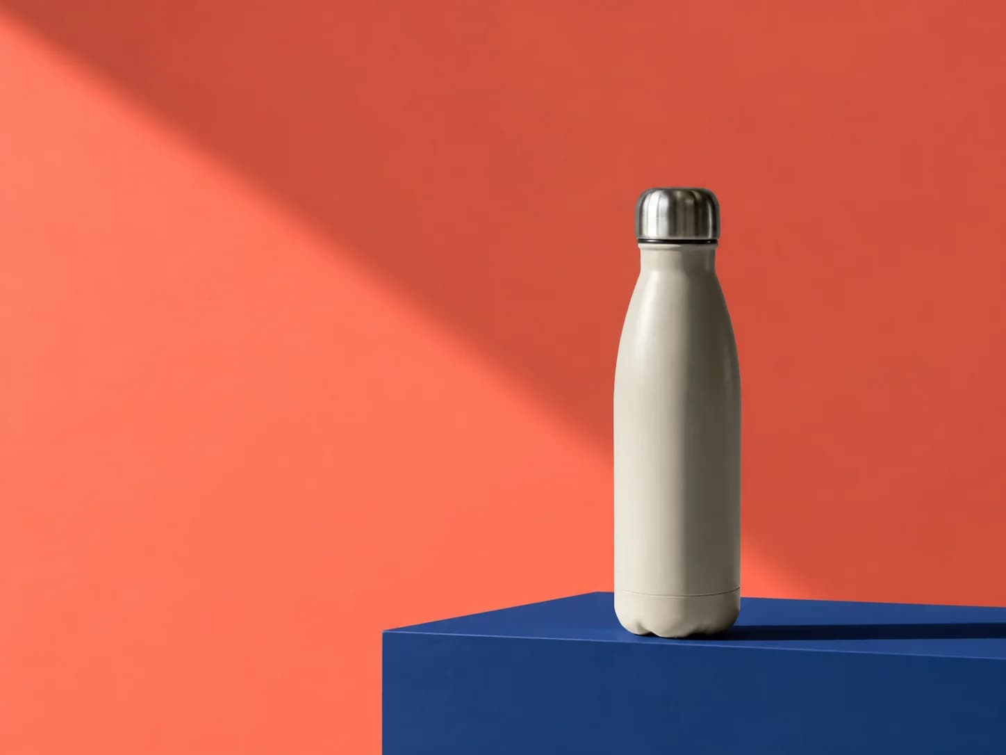 Campaign set
Use brand color, hard light and copy space for a campaign image.
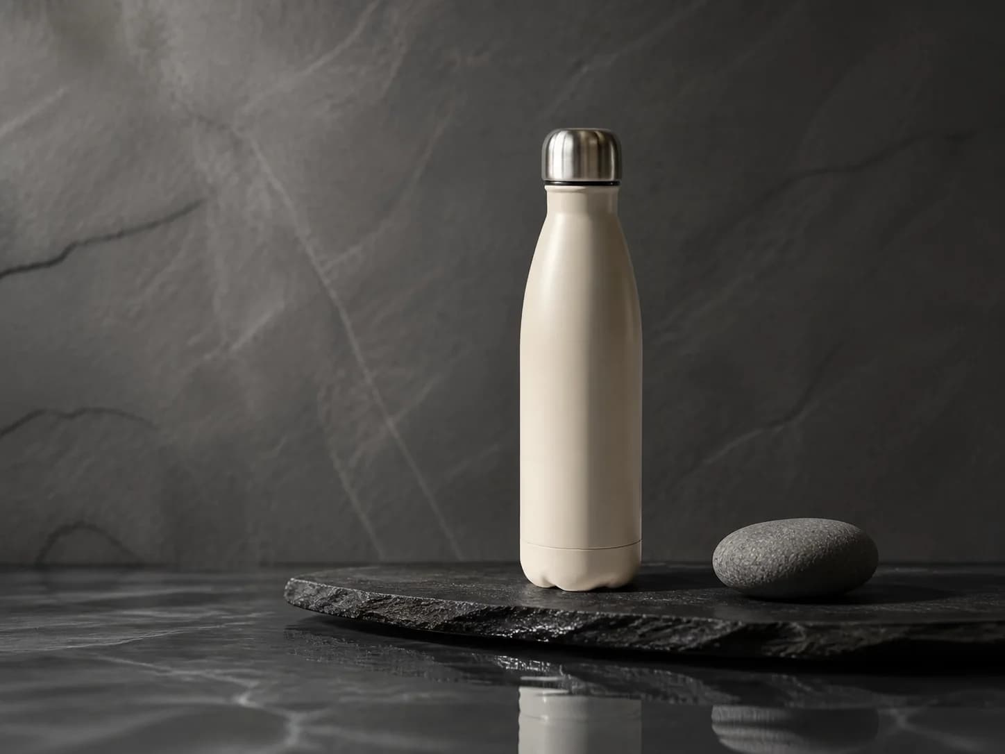 Material still life
Put tactile products in a restrained stone and water setting.
Start from a brief
Start from the story, not an uploaded product. Create a new image for a launch, article, research note or campaign.
Browse editorial directions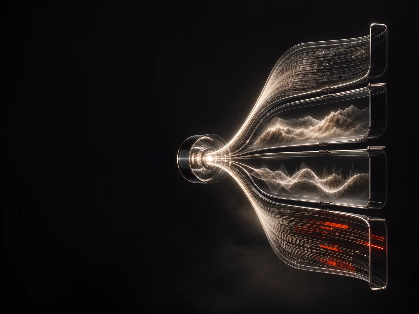 Conceptual 3D
Give a new capability a clear visual idea without inventing a product shot.
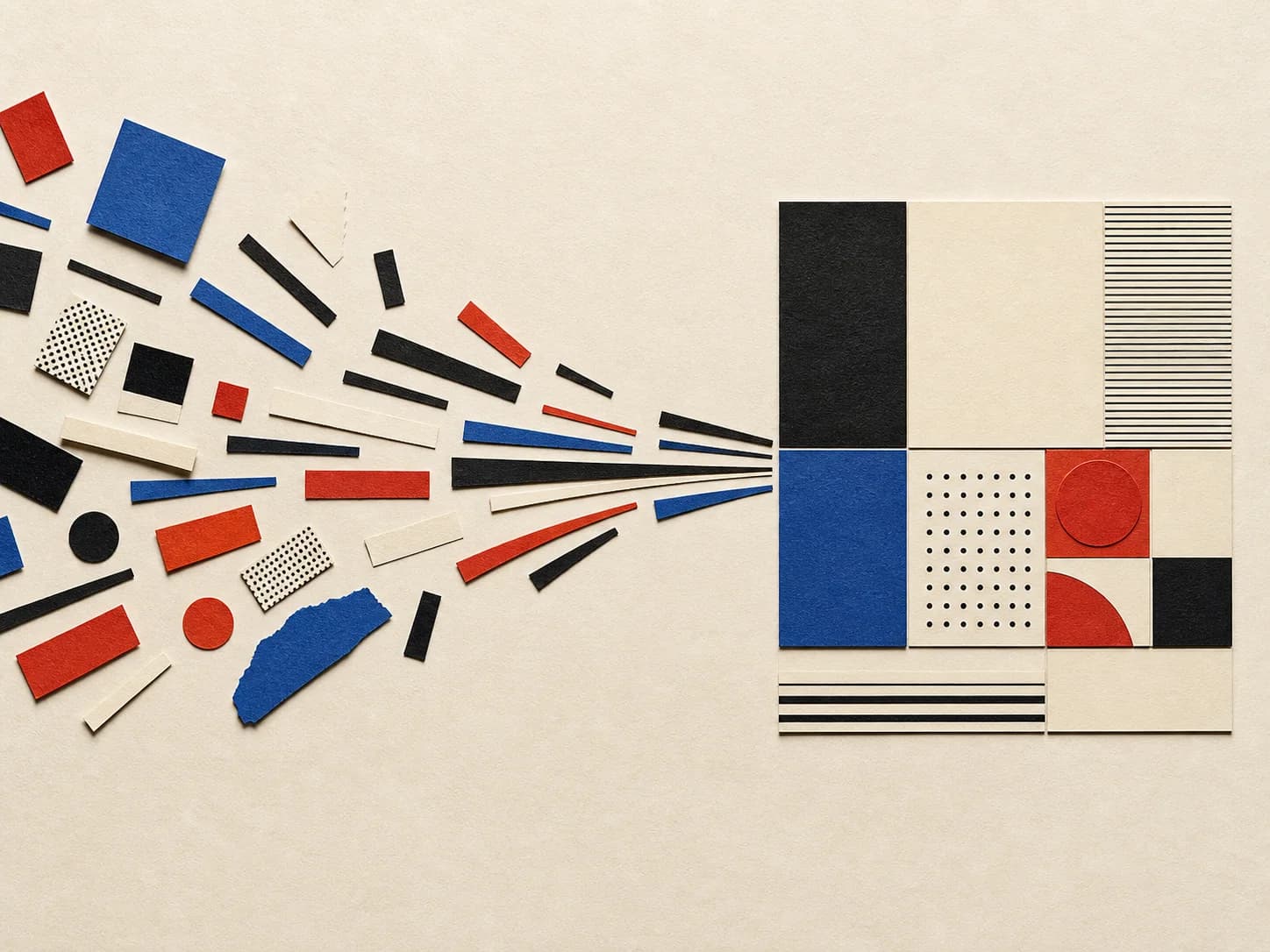 Cut-paper collage
Turn an abstract system or process into a readable article opener.
Generative lineworkMake experiments and progress visible without faking a chart.
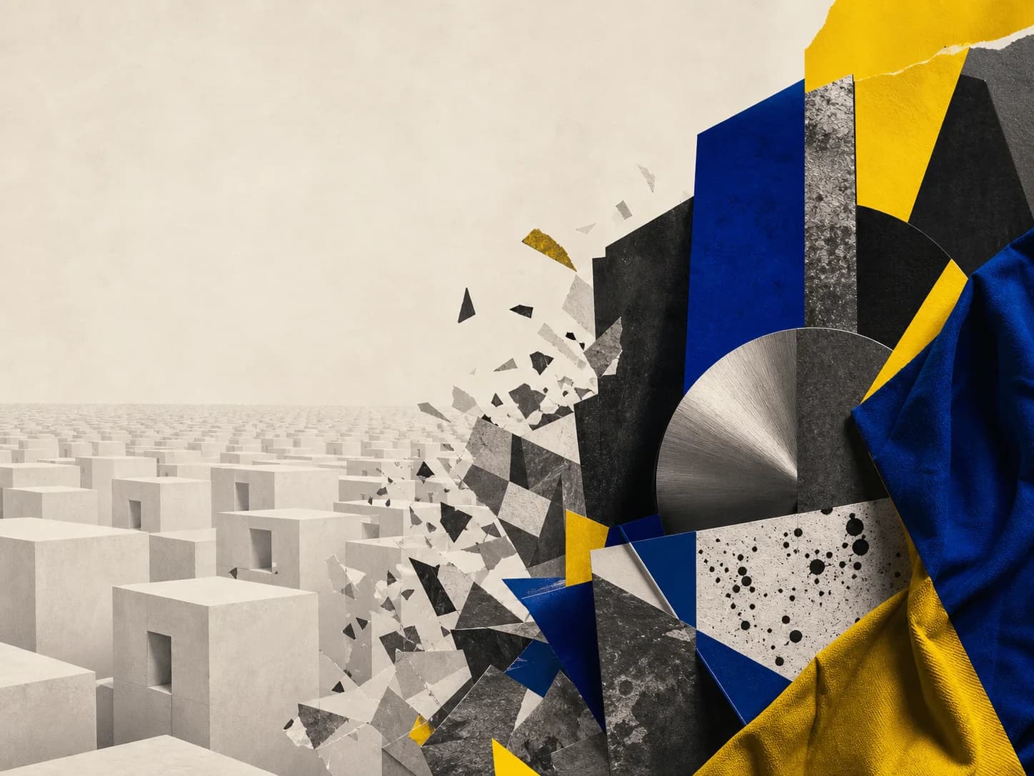 Photomontage
Build a visual metaphor for a change, tension or point of view.
Compare recognizable ways of drawing the same controls and surfaces. Every card renders the same live specimen, so you can judge the treatment itself instead of being distracted by a different mockup.
See all interface stylesAgent handoff
Keep the selected Design Kit's semantic tokens and typography. Apply the Swiss interface style to borders, elevation, states and motion.
The Design Kit still controls: the palette roles, type scale, spacing rhythm, content hierarchy and brand rules.
Swipe to compare live specimens.
A page recipe tells your agent what to show first, where the proof belongs and when to ask for action. Pick one based on the decision the visitor needs to make. Your Design Kit still controls the visual design.
Browse all 32 page recipesThese four recipes take different routes from first visit to next step.
Swipe to compare page flows.
Browse kits by visual style, or focus only on how a page opens. Both are lenses over the catalogs, not extra systems to reconcile.