Art Deco geometric graphic
Also called 1920s geometric design, stepped ornament, deco geometry, streamline geometric graphic, symmetrical stepped motif
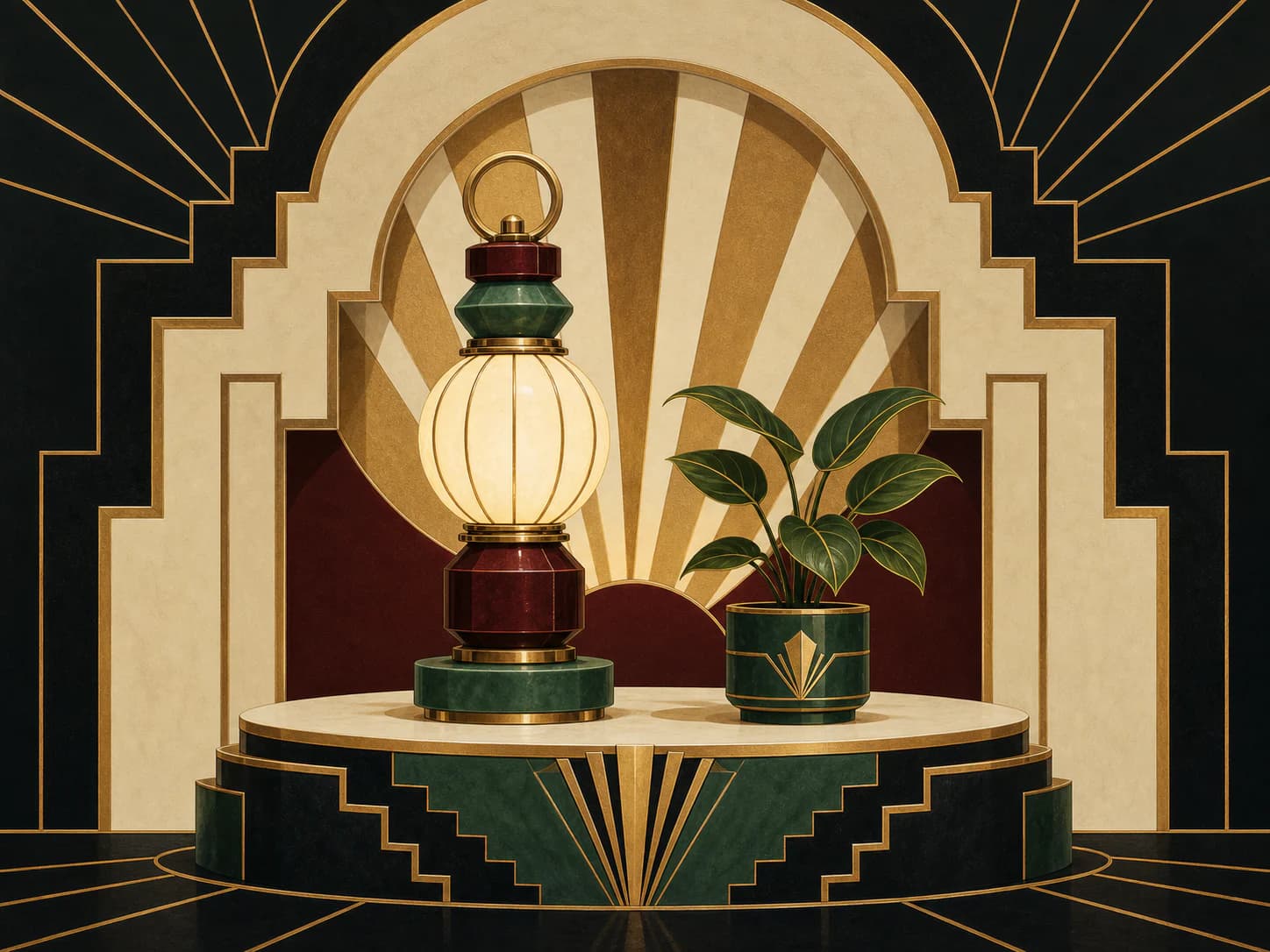
1Stepped, symmetrical geometry built from arcs, chevrons and setbacks, where the ornament is constructed rather than drawn.
Starting from a real product, person, or object? Keep that reference recognizable. Apply the direction to its setting, supporting elements, composition, light, surfaces, crop, and finish instead of redesigning the subject.
- Made by
- A historical design language of stepped, symmetrical geometry: repeated ornament built from arcs, chevrons and setbacks in a strictly controlled palette
- Control
- Prompt + reference — Words get you close; a style reference is what holds a whole set together.
Why it works
What the direction actually buys you when it lands.
- The ornament is generated by a rule — a repeated setback, a fixed arc radius, a constant step — so it is systematically extensible in a way freehand decoration is not.
- Strict symmetry plus vertical emphasis produces an immediate impression of formality and permanence, which is why it reads as luxury without requiring expensive materials.
- The palette is necessarily tight: a dark ground, one or two accents and a metallic, so it maps cleanly onto brand tokens.
- Its geometry is native to vector, meaning the same motif works as a hero, a divider, a badge and a background pattern without redrawing.
What you see
The perceptual fingerprint — check a candidate against these.
- Stepped setbacks: forms receding in discrete equal increments rather than tapering
- Strong bilateral symmetry around a vertical axis
- Arcs and chevrons at consistent angles, usually derived from a single radius
- A tight palette on a dark ground with one metallic or high-value accent
- Radiating fan and sunburst motifs used as a structural device, not as a sticker
Best fit
Where this direction is the right answer.
- Hospitality, events and premium launches needing formality
- Brands with a strong vertical logo or monogram that the geometry can echo
- Section dividers, badges and repeating background patterns from one motif
- Campaign work where a constructed, decorative hero is appropriate
Avoid when
Known-bad conditions. Pick another direction instead.
- The brand is casual, technical or contemporary-minimal
- Period association would misrepresent the product as retro
- You need photographic or human warmth
- The palette is wide or pastel — the language depends on a tight, contrasty set
Compatibility
How it behaves next to the rest of a design system.
Pairs with
- High-contrast display serifs and geometric capitals
- Deep, dark surface tokens
- Centred, symmetrical section layouts
- Kits with one metallic or high-value accent
Tension with
- Organic and handmade directions
- Asymmetric editorial layouts
- Pastel or low-contrast palettes
- Casual rounded UI
The geometry must be constructed, not decorated. If the motif cannot be described as a rule — this arc, repeated at this step, mirrored on this axis — the output will read as generic gold glamour rather than as this design language.
Accessibility
What has to be true before this ships to real readers.
- Metallic accents are often mid-value and fail contrast against dark grounds; verify any text colour against the actual ground rather than assuming gold reads as light
- High-frequency radiating motifs can shimmer — keep the finest step above roughly 2px at delivery size and never animate a sunburst
- Symmetry means the composition has no natural reading order; provide any sequence in adjacent copy
- Treat purely ornamental deco fields as decorative for alt text
Agent tags
The machine-readable handles an agent matches on when it picks a direction.
- geometric
- symmetrical
- stepped
- formal
- pattern-extensible
- tight-palette
- era-language
Build payload
ProWhat an agent needs to turn Art Deco geometric graphic into a repeatable production brief: prompt scaffold, constraints, parameters and review.