Generative linework
Also called plotter drawing, algorithmic line system, flow field lines, contour field, procedural linework
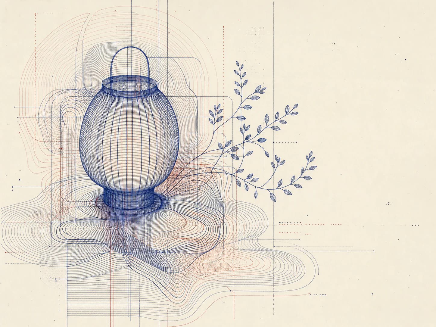
1Dense fields of thin uniform strokes following an algorithmic path, where structure emerges from accumulation rather than from drawing.
Starting from a real product, person, or object? Keep that reference recognizable. Apply the direction to its setting, supporting elements, composition, light, surfaces, crop, and finish instead of redesigning the subject.
- Made by
- Dense fields of thin uniform strokes whose paths follow a rule — a flow field, a distortion, an accumulation — rather than a drawn intention
- Control
- Prompt-steerable — Process, material and composition words are usually enough to land it repeatedly.
Why it works
What the direction actually buys you when it lands.
- Every stroke is the same weight, so the image has no focal hierarchy of its own and sits under text without competing — rare for a visually dense direction.
- Structure emerges from accumulation: where lines crowd, the eye reads form, so the composition can suggest depth or volume without any rendered shading.
- A single rule produces an unlimited family of variations, which makes it the cheapest direction here to generate a large consistent asset set from.
- Because it is line and ground only, it inverts cleanly between light and dark kit modes without a separate art direction.
What you see
The perceptual fingerprint — check a candidate against these.
- Uniform stroke weight throughout, with no thick-thin variation
- Lines following a coherent field: parallel, then bending together around an invisible attractor
- Density gradients — form implied by where strokes crowd rather than by tone
- Two colours only: line and ground
- A mechanical evenness of spacing that no hand would produce
Best fit
Where this direction is the right answer.
- Section backgrounds and ambient fields under text
- Technical, data and infrastructure brands wanting rigour without a diagram
- Large consistent asset sets generated from one rule
- Kits that must work identically in light and dark
Avoid when
Known-bad conditions. Pick another direction instead.
- You need warmth, a subject or human presence
- The page already carries dense linework in charts or diagrams
- The output must survive heavy compression or small display sizes
- The brand needs colour richness — this direction is two colours by nature
Compatibility
How it behaves next to the rest of a design system.
Pairs with
- Monospace and neo-grotesque typography
- Minimal, high-contrast kits
- Technical and data-led layouts
- Both light and dark modes without re-art-direction
Tension with
- Painterly and textured directions
- Photographic imagery in the same view
- Ornate era languages
- Colour-rich kits that need more than two tones
The failure mode is a picture of lines rather than a line system. Describe the rule the strokes follow — the field, the attractor, the accumulation — not the shape you want them to form, and let the structure emerge.
Accessibility
What has to be true before this ships to real readers.
- Fine parallel lines are the classic moiré risk: keep spacing above roughly 3px at delivery size and never animate the field
- Uniform weight means low local contrast; when used behind text, reduce line opacity rather than blurring, which preserves the character
- Dense linework compresses poorly and can shimmer on scroll; test at the real delivery resolution
- Mark generative fields as decorative rather than describing the pattern
Agent tags
The machine-readable handles an agent matches on when it picks a direction.
- generative
- line-system
- uniform-weight
- background-safe
- mode-agnostic
- rule-driven
- two-colour
Build payload
ProWhat an agent needs to turn Generative linework into a repeatable production brief: prompt scaffold, constraints, parameters and review.