Gouache editorial painting
Also called gouache painting, opaque watercolour, matte poster paint, designer gouache, flat brush painting
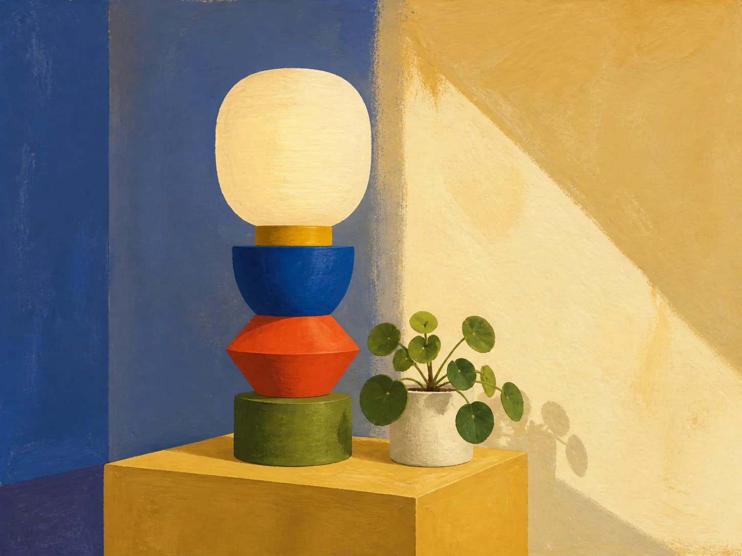
1Opaque matte paint in flat shapes with the brush edge left visible, giving the graphic control of vector work with a physical surface.
Starting from a real product, person, or object? Keep that reference recognizable. Apply the direction to its setting, supporting elements, composition, light, surfaces, crop, and finish instead of redesigning the subject.
- Made by
- Opaque water-based paint laid in flat matte passages with a visible brush edge, light over dark rather than glazed
- Control
- Prompt + reference — Words get you close; a style reference is what holds a whole set together.
Why it works
What the direction actually buys you when it lands.
- Gouache is opaque, so light passes go over dark ones — shapes can be built additively and edited, which produces the clean shape hierarchy vector illustration has, but with a paint surface.
- It dries completely matte with no specular highlight, so it reproduces predictably on screen and in print and never fights UI chrome the way an oil surface does.
- The brush edge stays visible at every shape boundary, which supplies the human evidence a flat vector lacks without adding texture noise across the whole image.
- A tight, flat palette is native to the medium, so it maps cleanly onto brand tokens while still looking painted.
What you see
The perceptual fingerprint — check a candidate against these.
- Flat, evenly matte colour fields with no gloss and no gradient
- Shape edges made by a brush stroke, slightly irregular but decisive
- Light values sitting on top of dark ones, opaquely, with the underlayer fully hidden
- Slight streaking within a large flat pass where the brush loaded unevenly
- Compact palette with distinct, separable colours rather than blended transitions
Best fit
Where this direction is the right answer.
- Editorial illustration that needs to look authored rather than generated
- Heroes for food, publishing, culture and considered consumer brands
- Editorial scenes where a photograph would be too literal
- Any place flat vector illustration is the default and reads as generic
Avoid when
Known-bad conditions. Pick another direction instead.
- You need photographic realism or exact product geometry
- The kit runs on gradients and glass; the matte flatness will look inert beside them
- You need very fine detail — gouache resolves detail worse than ink or vector
- The palette must be large; gouache wants a limited, decided set of colours
Compatibility
How it behaves next to the rest of a design system.
Pairs with
- Editorial serif and humanist sans typography
- Warm neutral and cream surfaces
- Asymmetric editorial layouts with generous margins
- Kits with flat fills and minimal elevation
Tension with
- Glassmorphic and heavily blurred layers
- Photographic imagery in the same section
- Chrome, metallic or high-gloss treatments
- Very large palettes with many similar hues
Gouache and flat vector illustration read as the same category at a glance but not up close, so mixing them in one view looks like an inconsistency rather than a range. Pick one and use it throughout.
Accessibility
What has to be true before this ships to real readers.
- Flat matte fields make contrast checking straightforward — sample the actual field colour rather than an average
- Because shapes are opaque and flat, this direction recolours to kit tokens more reliably than most; re-verify contrast after any recolour
- Keep type off the streaked passages where local value varies, or give it a solid backing shape
- Alt text should carry the depicted idea, since editorial gouache usually carries a concept
Agent tags
The machine-readable handles an agent matches on when it picks a direction.
- opaque
- matte
- flat-shapes
- editorial
- palette-driven
- recolourable
- authored
Build payload
ProWhat an agent needs to turn Gouache editorial painting into a repeatable production brief: prompt scaffold, constraints, parameters and review.