Oil impasto
Also called impasto painting, thick oil paint, raised brushwork, palette-knife paint, textured oil painting
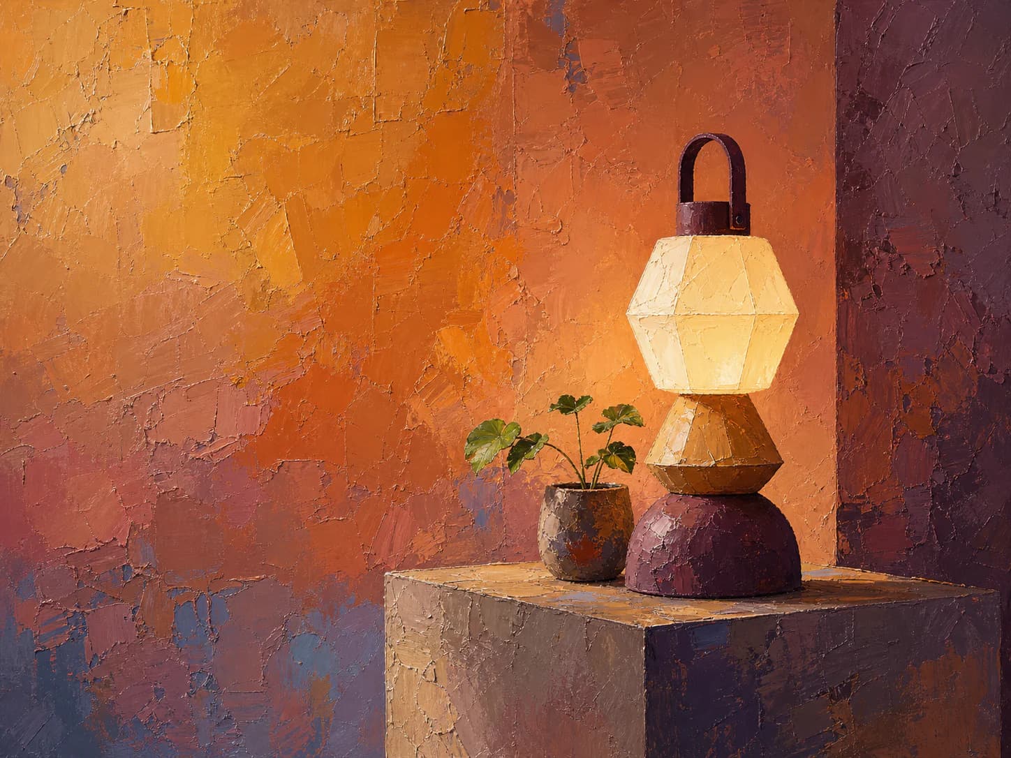
1Paint applied thickly enough to cast its own shadows, so the surface reads as a made object before it reads as a picture.
Starting from a real product, person, or object? Keep that reference recognizable. Apply the direction to its setting, supporting elements, composition, light, surfaces, crop, and finish instead of redesigning the subject.
- Made by
- Oil or heavy-body acrylic laid on thickly enough that the paint holds its own ridges, worked with a loaded brush or a knife
- Control
- Prompt + reference — Words get you close; a style reference is what holds a whole set together.
Why it works
What the direction actually buys you when it lands.
- Relief is a light effect, not a colour effect, so the texture survives greyscale, small crops and low-colour print — the image still looks expensive when the palette is stripped.
- Physical evidence of a hand reads as expense and intent, which is why it carries premium and cultural positioning without needing a luxury palette.
- The ridges pool value at the stroke edges, so a very limited palette still produces a wide tonal range and a clear focal hierarchy.
- Because form is carried by directional strokes rather than fine detail, the subject stays legible when the asset is scaled down to a card.
What you see
The perceptual fingerprint — check a candidate against these.
- Ridges of paint that cast real shadows, so the light direction is readable from the relief alone
- Directional stroke marks that follow the form rather than a uniform fill
- Edges built from abutted strokes — colour changes at a stroke boundary, not at a blend
- Broken colour: neighbouring strokes stay slightly unmixed instead of averaging to one hue
- Canvas or panel weave showing through in the thin passages
Best fit
Where this direction is the right answer.
- A hero that needs warmth and authorship without a photograph of a person
- Premium or craft positioning where a flat vector illustration would read as cheap
- Cultural, hospitality and food pages where material richness is the message
- Campaign art that must hold up as a single large image with type set beside it
Avoid when
Known-bad conditions. Pick another direction instead.
- The image must sit under body copy — the relief competes with text and destroys contrast
- You need exact product fidelity: impasto will invent geometry and smear labels
- The asset will be shown below roughly 200px, where the ridges collapse into noise
- You need many near-identical assets: stroke placement varies run to run
Compatibility
How it behaves next to the rest of a design system.
Pairs with
- High-contrast serif or humanist sans display type
- Warm, desaturated neutral surfaces
- Generous whitespace and a single large asset per section
- Kits with soft or no elevation — the paint already supplies depth
Tension with
- Flat geometric vector illustration in the same view
- Glassmorphic or heavily blurred UI layers
- Dense multi-column data or dashboard surfaces
- Neon or fully saturated accent palettes
Impasto brings its own light and depth. Treat it as the one textured element in a view and keep every surface around it flat, or the page reads as two competing materials.
Accessibility
What has to be true before this ships to real readers.
- Never set text over the textured area; reserve a genuinely thin, low-relief passage or an adjacent flat panel for type
- Check contrast against the darkest ridge shadow, not the average colour of the region
- The texture carries no information, so alt text should describe the subject and mood, not the brushwork
- Avoid parallax or scroll-scale on impasto: moving high-frequency relief triggers motion discomfort
Agent tags
The machine-readable handles an agent matches on when it picks a direction.
- texture-heavy
- warm
- premium
- handmade
- needs-crop-room
- hero-scale
- low-repeatability
Build payload
What an agent needs to turn Oil impasto into a repeatable production brief: prompt scaffold, constraints, parameters and review.
Prompt scaffold
Five separable facets. For original artwork, the subject may vary. For a supplied product or other reference, keep its identity fixed and vary the scene around it. Keep the process wording consistent.
- Process
- oil paint applied thickly with a loaded brush and palette knife, paint standing proud of the surface, strokes abutted rather than blended
- Surface
- medium-tooth primed linen, weave visible in the thin passages, ridges catching light along their crests
- Light
- single directional key from one side at a low angle so the paint relief casts its own micro-shadows, soft ambient fill
- Composition
- one clear subject held to one third of the frame, the opposing third kept as quiet low-relief field for typography
- Finish
- matte to satin, broken colour with neighbouring strokes left unmixed, no varnish gloss, no digital sharpening
Example prompt
A ceramic table lamp and a small potted plant on a plain plinth, painted in thick oil impasto with a loaded brush and palette knife; paint stands proud of the surface with abutted, unblended strokes; medium-tooth primed linen with weave showing in the thin passages; low-angle directional key light from the right so the paint ridges cast their own shadows; subject held to the right third with the left third kept as a quiet, low-relief warm wall for headline type; warm ochre, terracotta and plum palette; matte finish, broken colour, no gloss varnish.
Exclude
Oil impasto's known failure modes — state these as negatives.
- no smooth airbrushed gradients or digital blending
- no uniform swirl or frosting-like repeated strokes
- no signature, monogram or painted lettering
- no heavy relief across the reserved type area
- no muddy grey-brown from over-mixed neighbouring strokes
- no fine text, logos or product labels on the subject
- no glossy varnish highlights or specular blowout
Parameters
- Aspect
- 4:3 or 3:2 for hero; keep the subject inside the centre 60% so a 16:9 crop survives
- Resolution
- Generate at 2x delivery width — ridge detail is the first thing lost to downscaling
- Reference strength
- Medium (roughly 0.4–0.6). Higher locks stroke scale to the reference and flattens subject variety
- Palette
- Cap at four families plus one neutral; broken colour multiplies apparent hues on its own
- Guidance
- Low to mid. High guidance smooths the paint back toward a clean digital render
- Upscale
- Detail-preserving upscale only; denoising or face-restore passes erase the relief
Holding a whole set
- Fix stroke scale first: state an approximate brush width relative to the frame and repeat it verbatim across the set
- Reuse one palette list in every prompt; broken colour drifts fast if hues are left to the model
- Keep the key light on the same side for the whole set, otherwise the relief appears to flip direction between assets
- Hold one canvas weave and one substrate description across all prompts
- Vary subject and crop, never process wording — the process block is the direction's identity
- For a large set, promote one accepted output to the style reference rather than re-describing the look
Before you ship
- Does the relief describe the form, or is it decorative texture laid over a flat image?
- Is there a genuinely quiet passage sized for the headline, and does it still meet contrast?
- Does the subject stay readable at card size and in greyscale?
- Are the colours still separated, or have the strokes averaged into mud in the shadows?
- Any hallucinated lettering, signature or label to remove?
- Does the light direction match the rest of the set?