Ink wash drawing
Also called diluted ink wash, brush wash drawing, monochrome ink painting, tonal brush drawing, grey wash drawing
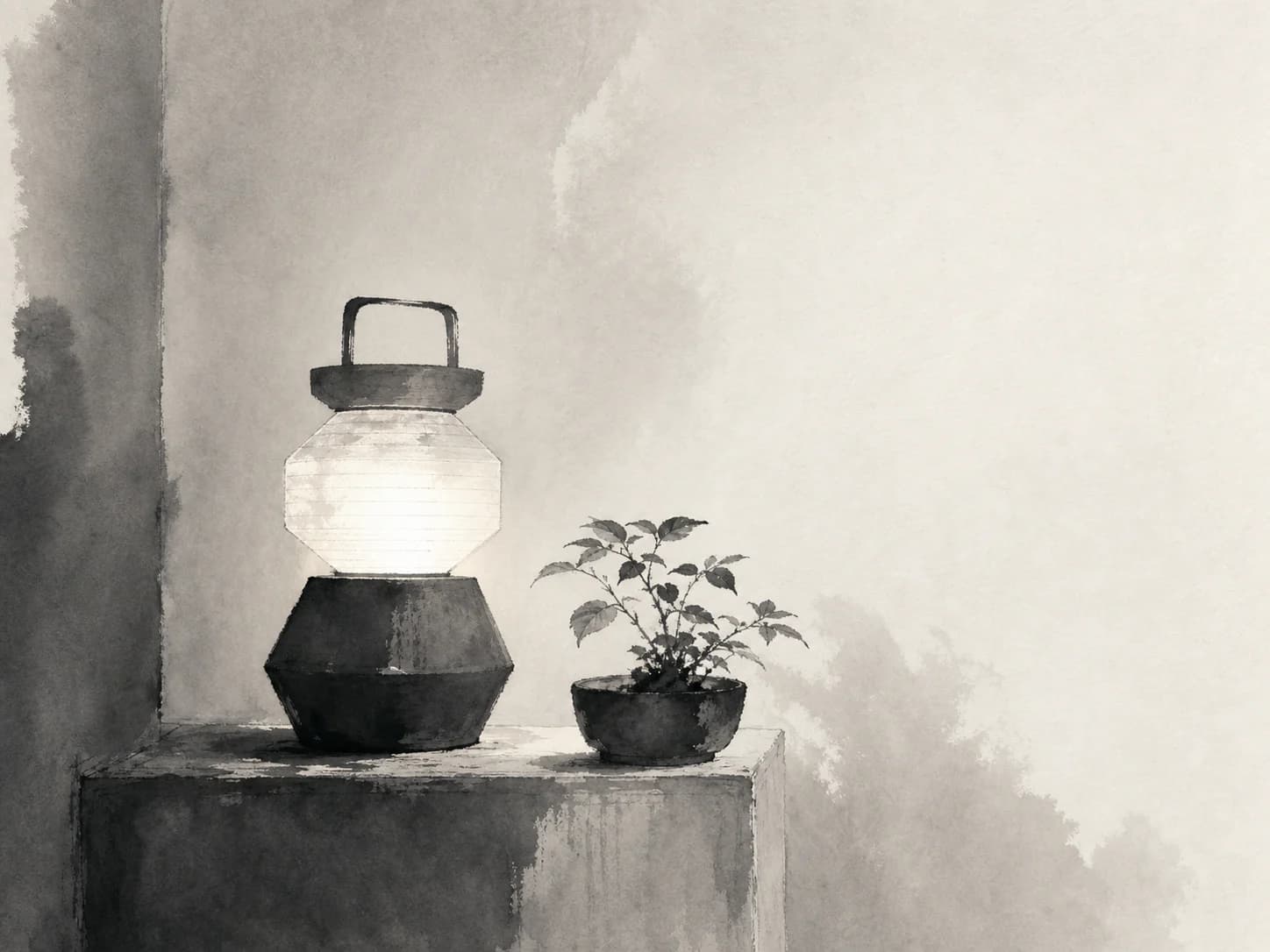
1One black ink diluted into a few fixed strengths and brushed on, where the empty paper is composed as deliberately as the marks.
Starting from a real product, person, or object? Keep that reference recognizable. Apply the direction to its setting, supporting elements, composition, light, surfaces, crop, and finish instead of redesigning the subject.
- Made by
- Black ink diluted to a series of dilutions and applied with a soft brush, tone built by dilution and the number of passes rather than by line
- Control
- Prompt + reference — Words get you close; a style reference is what holds a whole set together.
Why it works
What the direction actually buys you when it lands.
- Tone comes from dilution, so the whole image is one pigment at three or four strengths — an extremely small vocabulary that forces every mark to be decided rather than adjusted.
- The brush loads and unloads within a single stroke, so a mark carries both its darkest and lightest value; that internal variation is what makes it read as gestural rather than filled.
- Empty paper is treated as an active compositional element, not a leftover, which gives the direction unusual restraint and makes it sit calmly next to type.
- Being a single ink, it composites cleanly onto any surface colour and never argues with the kit palette.
What you see
The perceptual fingerprint — check a candidate against these.
- Three or four discrete tonal strengths rather than a continuous gradient
- Brush strokes that darken where the brush landed and lighten as it lifted, within one mark
- Large expanses of untouched paper composed as deliberate negative space
- Soft-edged pooling where a wash was laid onto damp paper, next to a dry crisp stroke
- Occasional dry-brush skip where the brush ran out mid-stroke
Best fit
Where this direction is the right answer.
- Calm, restrained editorial for hospitality, wellness and cultural content
- Section backgrounds where a very light wash can sit under type safely
- Brands whose positioning is quiet, considered or minimal
- Any kit that repaints — a single-ink drawing survives every palette change
Avoid when
Known-bad conditions. Pick another direction instead.
- You need colour, detail or product accuracy
- The brand is loud, commercial or urgent
- The layout is dense — this direction needs the surrounding whitespace to work
- You need many assets fast; the gesture quality is hard to hold across a large set
Compatibility
How it behaves next to the rest of a design system.
Pairs with
- Light serif and humanist type at generous sizes
- Bone, paper and warm off-white surfaces
- Very generous whitespace and asymmetric layout
- Single-accent or monochrome kits
Tension with
- Saturated multi-colour palettes
- Dense grid and dashboard layouts
- Gloss, chrome and gradient treatments
- Other high-texture directions in the same view
The negative space is part of the asset. Cropping an ink wash tight to its subject removes the thing that makes it work, so it needs layout space allocated rather than being dropped into a fixed card.
Accessibility
What has to be true before this ships to real readers.
- Because the tone is discrete rather than continuous, a light wash used behind text can be capped at a known value and verified once
- Never place body copy over the darkest wash strength; reserve the palest strength for anything text sits on
- The direction carries no hue, so it holds up in forced-colours and high-contrast modes
- Where a wash is purely ambient, mark it decorative rather than writing alt text for it
Agent tags
The machine-readable handles an agent matches on when it picks a direction.
- monochrome
- single-ink
- calm
- negative-space
- background-safe
- palette-independent
- gestural
Build payload
ProWhat an agent needs to turn Ink wash drawing into a repeatable production brief: prompt scaffold, constraints, parameters and review.