Lithographic poster
Also called stone lithograph poster, planographic print, litho crayon poster, printed travel poster, flat-colour lithograph
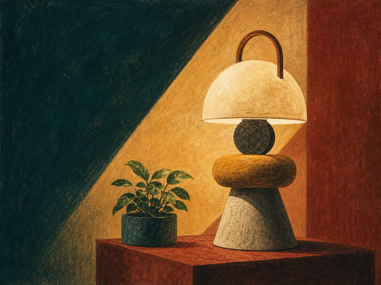
lithographic-poster/v1Flat printed colour areas drawn with a greasy crayon on a grained stone, so every flat has a soft granular tooth inside it.
- Made by
- Planographic printing from a drawn stone or plate: greasy litho crayon on a grained surface, printed as flat colour areas with visible crayon tooth
- Control
- Prompt + reference — Words get you close; a style reference is what holds a whole set together.
Why it works
What the direction actually buys you when it lands.
- Colour is laid as separate flat areas rather than blended, which produces the confident, poster-scale simplification the format is known for — legible from across a street.
- Litho crayon on a grained stone leaves a fine granular tooth inside each flat, so the areas are simplified without being sterile the way flat vector is.
- Each colour is a separate printing, so the palette is necessarily small and every hue is a deliberate decision with a job.
- The format has a built-in compositional convention — large image area, reserved title band — that makes it unusually easy to design a hero around.
What you see
The perceptual fingerprint — check a candidate against these.
- Flat colour areas with a fine granular crayon tooth visible inside them
- Simplified, confident shapes with almost no rendered detail
- A small number of printed colours with occasional overlap producing a deeper tone
- Soft-edged crayon shading used sparingly at the edges of a form, never a smooth gradient
- A reserved band of flat colour at the top or bottom where type belongs
Best fit
Where this direction is the right answer.
- Campaign and event heroes that need to feel designed rather than photographed
- Travel, culture and institutional pages with a strong sense of place
- Any hero where a headline must sit inside the artwork rather than beside it
- Brands with a small, decided palette and a poster-like visual language
Avoid when
Known-bad conditions. Pick another direction instead.
- You need product accuracy or fine detail
- The brand palette is large or gradient-based
- The layout is dense and the image must be small
- Period pastiche would misrepresent the brand — this format carries a strong historical read
Compatibility
How it behaves next to the rest of a design system.
Pairs with
- Condensed grotesque and geometric display type
- Warm paper-toned surfaces
- Full-bleed hero sections
- Kits with a small number of strong flat accents
Tension with
- Photographic imagery in the same view
- Glassmorphism, gradients and elevation systems
- Very large or subtle tonal palettes
- Dense data-heavy layouts
The reserved title band is structural, not decorative. Prompt it as flat colour and set the real headline in the kit's typeface on top — generated poster lettering is unusable and will need removing anyway.
Accessibility
What has to be true before this ships to real readers.
- The reserved title band is a flat known colour, so type placed there can be contrast-verified once and trusted
- Never set type over the crayon-shaded areas where local value varies
- Because the palette is small and flat, this direction recolours to kit tokens reliably — re-verify contrast after recolouring
- Alt text should describe the depicted scene, since a poster usually carries a concrete subject
Agent tags
The machine-readable handles an agent matches on when it picks a direction.
- poster
- flat-colour
- limited-palette
- crayon-tooth
- title-band
- recolourable
- hero-scale
Build payload
ProWhat an agent needs in order to actually generate Lithographic poster — prompt scaffold, constraints, parameters and review.