Technical blueprint
Also called engineering drawing, orthographic technical illustration, plan drawing, draughted schematic, measured line drawing
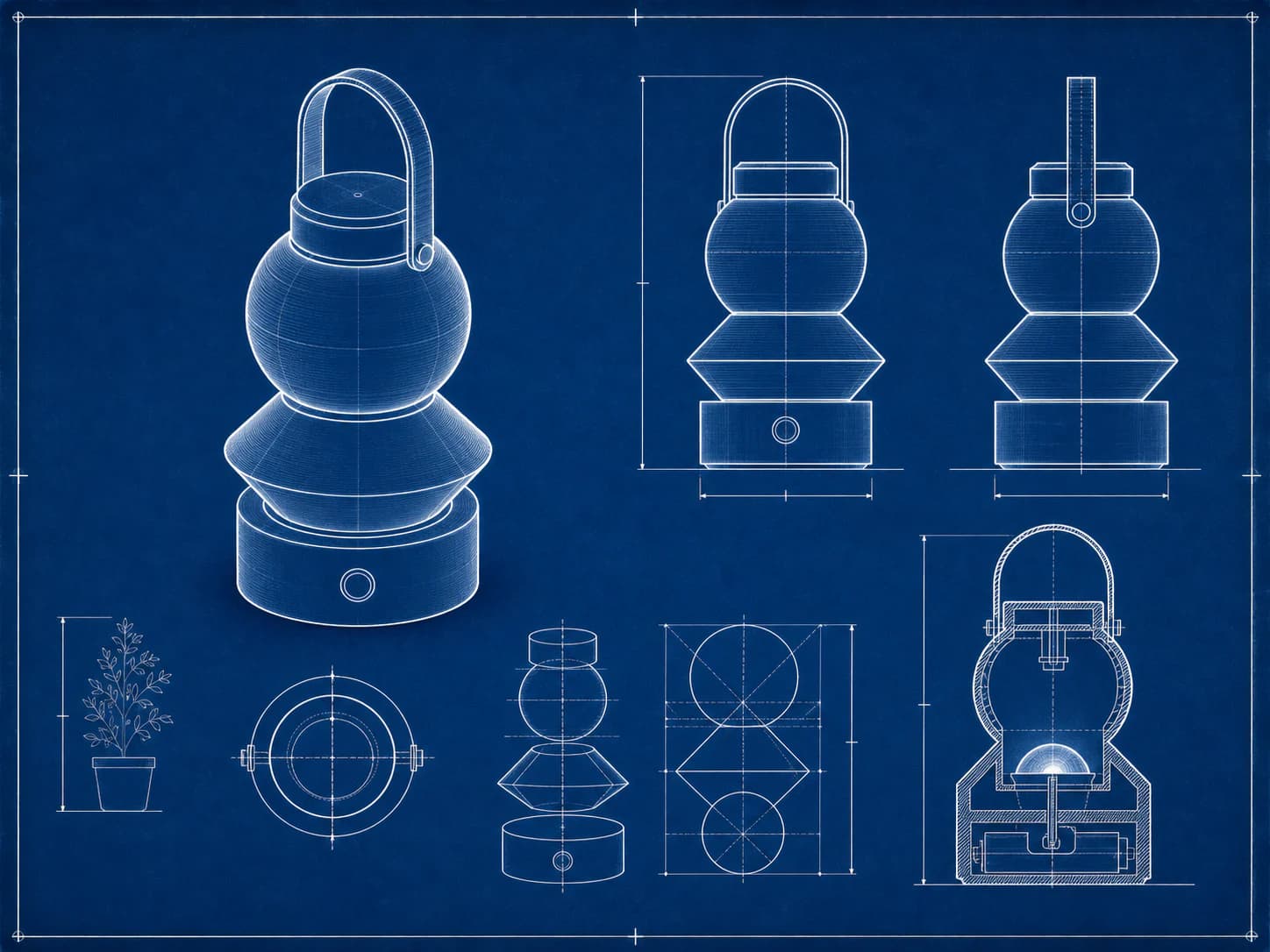
1Draughted orthographic line drawing with a strict line-weight hierarchy, where the drafting conventions themselves signal rigour.
Starting from a real product, person, or object? Keep that reference recognizable. Apply the direction to its setting, supporting elements, composition, light, surfaces, crop, and finish instead of redesigning the subject.
- Made by
- Draughted orthographic line drawing with a hierarchy of line weights, dimension and centre lines, and a two-tone construction-plan colour convention
- Control
- Prompt-steerable — Process, material and composition words are usually enough to land it repeatedly.
Why it works
What the direction actually buys you when it lands.
- Orthographic projection removes perspective, so nothing is foreshortened and every part is shown at true proportion — the drawing reads as measurement rather than as depiction.
- The line-weight hierarchy is meaningful: heavy for outer edges, medium for visible edges, fine for hidden and dimension lines. That system is what makes the drawing feel authoritative instead of merely blue.
- It signals engineering rigour without requiring the depicted object to exist yet, which makes it unusually honest for pre-launch and conceptual products.
- Line and ground only means it repaints entirely from two kit tokens and works in both modes by inversion.
What you see
The perceptual fingerprint — check a candidate against these.
- Orthographic projection with no perspective convergence anywhere
- A clear hierarchy of at least three line weights doing different jobs
- Dimension lines with arrowheads, plus extension lines running clear of the object
- Hidden edges as evenly dashed lines and centre lines in dash-dot
- Two colours only: a light line on a saturated ground, or its inversion
Best fit
Where this direction is the right answer.
- Hardware, engineering, infrastructure and developer-tool explainers
- Pre-launch products where a photograph would overpromise
- Process and architecture diagrams that must feel measured
- Section backgrounds where a faint plan field adds rigour under text
Avoid when
Known-bad conditions. Pick another direction instead.
- The brand is warm, consumer or lifestyle-led
- The object needs to look desirable rather than understood
- The page already carries dense diagrams
- Non-technical audiences would find the conventions cold or confusing
Compatibility
How it behaves next to the rest of a design system.
Pairs with
- Monospace and technical sans typography
- Deep saturated surface tokens, or crisp light ones inverted
- Data-led and documentation layouts
- Minimal kits with hard edges and low elevation
Tension with
- Painterly and handmade directions
- Photographic product imagery in the same view
- Warm consumer registers
- Colour-rich kits needing more than two tones
The colour is the least important part. A blue ground with sloppy uniform-weight lines and a vanishing point is not this direction; a two-tone drawing with correct orthographic projection and a real line-weight hierarchy is, in any palette.
Accessibility
What has to be true before this ships to real readers.
- Fine dimension and hidden lines fall below usable contrast when the direction is faded for background use; generate a separate low-density background variant instead of reducing the opacity of the explainer asset
- Dashed and dash-dot lines can shimmer on scroll — keep dash lengths coarse and never animate the field
- Never rely on generated dimension figures: they are always nonsense. Any real measurement belongs in adjacent HTML text
- When the drawing explains something, alt text must convey the explanation, not the aesthetic
Agent tags
The machine-readable handles an agent matches on when it picks a direction.
- orthographic
- line-weight-hierarchy
- two-colour
- technical
- mode-agnostic
- explainer-ready
- no-perspective
Build payload
What an agent needs to turn Technical blueprint into a repeatable production brief: prompt scaffold, constraints, parameters and review.
Prompt scaffold
Five separable facets. For original artwork, the subject may vary. For a supplied product or other reference, keep its identity fixed and vary the scene around it. Keep the process wording consistent.
- Process
- draughted orthographic line drawing with no perspective convergence, built from a hierarchy of three line weights — heavy outer edges, medium visible edges, fine dimension and extension lines
- Surface
- line and ground only, flat with no fills, no shading and no texture, hidden edges evenly dashed and centre lines in dash-dot
- Light
- none — this is a measured drawing, not a rendering; there is no shadow and no tonal modelling anywhere
- Composition
- one primary orthographic view with two smaller auxiliary views, dimension lines with arrowheads running clear of the object, ground reserved for typography
- Finish
- two colours only, crisp uniform strokes within each weight class, no gradients, fills or rendered material
Example prompt
A draughted orthographic blueprint of a compact desktop device: one large front elevation with a smaller side elevation and a plan view arranged beside it, all in true orthographic projection with no perspective convergence anywhere; a strict hierarchy of three line weights — heavy outer edges, medium visible internal edges, fine dimension and extension lines; hidden edges as evenly dashed lines and centre lines in dash-dot; dimension lines with arrowheads running clear of the object; line and ground only, flat with no fills, shading or texture; two colours only, a pale cyan line on a deep navy ground; clear ground reserved along the right for typography; no perspective, no shadows, no rendered material, no dimension figures, callout numbers or lettering of any kind.
Exclude
Technical blueprint's known failure modes — state these as negatives.
- no perspective or vanishing points
- no shading, fills, gradients or rendered material
- no generated dimension figures, callout numbers or annotation text
- no uniform single-weight linework
- no more than two colours
- no photographic elements or textures
- no title blocks, stamps or company marks
Parameters
- Projection
- State 'orthographic, no perspective convergence' explicitly — models default to a perspective view
- Line-weight hierarchy
- Name all three classes and their jobs. This is what separates the direction from blue-tinted line art
- Line conventions
- Specify dashed hidden edges and dash-dot centre lines by name; they carry most of the technical read
- Annotation
- Exclude all generated figures and callouts. Real numbers go in adjacent HTML, always
- Colour
- Exactly two kit tokens. Inverts for the opposite mode without regeneration
- Background variant
- Generate a separate lower-density version for use under text rather than fading the explainer asset
Holding a whole set
- Fix the three line weights as an explicit ratio and reuse it across every drawing in the set
- Keep the view arrangement convention constant — which elevation is primary and where the auxiliaries sit
- Hold the line and ground tokens fixed and derive the opposite mode by inversion
- Use one dash length and one dash-dot pattern throughout so the conventions read as a single drafting standard
- Place all labels, dimensions and callouts in real HTML text positioned over the drawing
- Vary the depicted object, never the projection, weight-hierarchy or two-colour wording
Before you ship
- Are parallel edges genuinely parallel, with no perspective convergence?
- Are there at least three distinguishable line weights doing different jobs?
- Are hidden edges dashed and centre lines dash-dot, per convention?
- Has any generated dimension figure, callout or lettering survived? Remove all of it
- Are there exactly two colours, with no fills or shading introduced?
- If used behind text, is this the separate low-density variant rather than a faded explainer asset?