Linocut relief print
Also called linoleum cut, lino print, relief block print, carved block print, reduction lino print
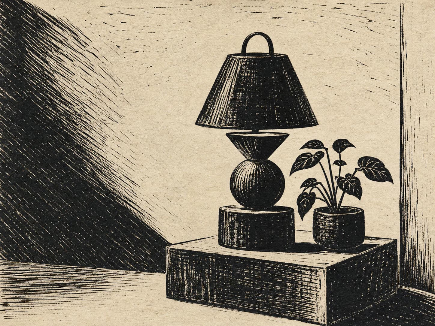
1An image cut in reverse into a block, where every white mark is a gouge and every black area is what was left standing.
Starting from a real product, person, or object? Keep that reference recognizable. Apply the direction to its setting, supporting elements, composition, light, surfaces, crop, and finish instead of redesigning the subject.
- Made by
- A linoleum block carved with gouges and printed in relief: the uncarved surface takes ink, everything gouged away prints as paper
- Control
- Prompt + reference — Words get you close; a style reference is what holds a whole set together.
Why it works
What the direction actually buys you when it lands.
- The process is subtractive and irreversible, which forces bold decisions: there is no way to add a thin light detail back, so the image resolves into strong shapes.
- Marks carry the shape of the tool that made them — a U-gouge and a V-gouge leave visibly different tracks — so the texture is legibly caused rather than applied.
- Ink coverage from a hand-inked block is slightly uneven, breaking up large blacks so they read as printed rather than as digital fill.
- It is a genuine one-colour process, so it reproduces on any substrate at any size and works as merch, packaging and screen equally.
What you see
The perceptual fingerprint — check a candidate against these.
- White marks that are clearly gouge tracks, with a rounded or V-shaped profile and a tapering end
- Bold black shapes with slightly ragged, chipped edges where the blade left the line
- Uneven ink coverage within large blacks — lighter where the block took less ink
- A visible impression edge where the block met the paper
- No mid-tones: texture is created by the density of gouge marks, not by grey
Best fit
Where this direction is the right answer.
- Maker, food, craft and event brands where a printed artefact suits the positioning
- Campaign and merch-adjacent artwork that must work in one colour
- Editorial art with a strong single subject and no need for detail
- Packaging and label imagery where the print process is part of the story
Avoid when
Known-bad conditions. Pick another direction instead.
- The subject needs fine detail or accurate product geometry
- You need mid-tones or a broad tonal range
- The brand is precise, technical or corporate
- The asset will render small — the gouge marks close up and the image goes solid
Compatibility
How it behaves next to the rest of a design system.
Pairs with
- Bold slab and grotesque display type
- Warm paper-toned and cream surfaces
- Flat single-accent palettes
- Kits with hard edges and no elevation
Tension with
- Gradient and glass treatments
- Photographic imagery in the same section
- Soft rounded UI with heavy shadows
- Palettes needing many hues in one asset
Linocut is a one-ink process. Multi-colour lino exists but requires separate blocks and shows registration offset, so if the kit needs two colours here, prompt it as two blocks with visible registration rather than as a full-colour image.
Accessibility
What has to be true before this ships to real readers.
- One-colour relief prints have inherently high contrast, but check that the gouge-mark texture is not carrying meaning that disappears at small sizes
- Do not place text on the print; the ragged black edges make local contrast unpredictable
- When inverting for a dark kit, re-author the block logic rather than inverting the bitmap — an inverted linocut reads as a photographic negative
- Alt text should describe the depicted subject, not the printmaking
Agent tags
The machine-readable handles an agent matches on when it picks a direction.
- one-ink
- high-contrast
- carved
- bold-shapes
- no-midtones
- print-artefact
- merch-safe
Build payload
ProWhat an agent needs to turn Linocut relief print into a repeatable production brief: prompt scaffold, constraints, parameters and review.