Pen-and-ink crosshatching
Also called crosshatch linework, engraved hatching, parallel hatch drawing, engraving-like drawing, nib hatching
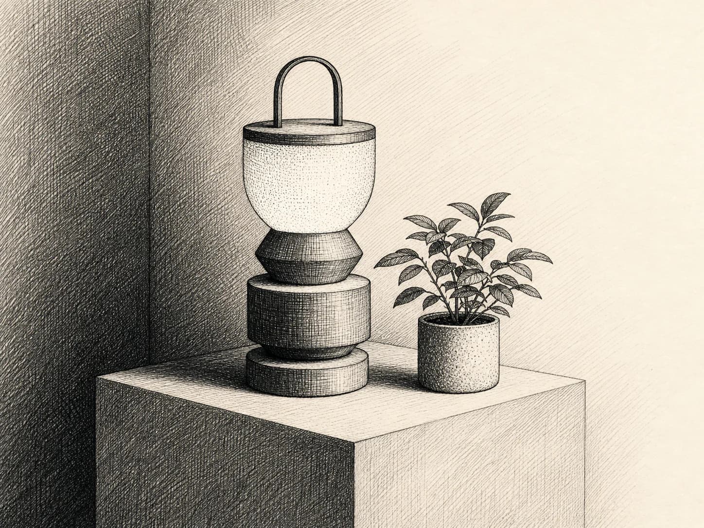
1Tone made only from crossing sets of parallel lines, so the drawing carries value and volume without a single grey fill.
Starting from a real product, person, or object? Keep that reference recognizable. Apply the direction to its setting, supporting elements, composition, light, surfaces, crop, and finish instead of redesigning the subject.
- Made by
- Pen and black ink on white paper, tone built entirely from layered sets of parallel strokes rather than from wash or fill
- Control
- Prompt + reference — Words get you close; a style reference is what holds a whole set together.
Why it works
What the direction actually buys you when it lands.
- Every value is line, so the image is pure black on white — it reproduces perfectly in one ink, on any surface colour, at any size the lines survive.
- Hatch direction follows form, so volume is described by the same marks that describe tone; the drawing explains an object as it renders it.
- Density is a controllable dial: the eye reads a focal point wherever the hatching is densest, which makes hierarchy explicit rather than accidental.
- The vocabulary is old and legible — it signals rigour, provenance and craft without any period costume.
What you see
The perceptual fingerprint — check a candidate against these.
- Sets of parallel strokes crossing at a consistent angle to darken value
- Line weight and spacing that taper as a form turns away from the light
- White paper left completely untouched in the highlights — no grey wash anywhere
- Contour-following hatch that curves with the surface rather than staying flat to the page
- Crisp, slightly irregular stroke ends where the nib lifted
Best fit
Where this direction is the right answer.
- Editorial and long-form article art that must sit next to serious prose
- Explainers, diagrams and field-guide style detail where precision reads as credibility
- Single-ink contexts: letterpress-adjacent print, one-colour merch, dark-mode inversion
- Brands that need craft and rigour without warmth or nostalgia
Avoid when
Known-bad conditions. Pick another direction instead.
- The asset will be displayed small or on a low-DPI screen — the hatch aliases into grey mush
- You need a warm, approachable or playful tone; hatching always reads as formal
- The subject is a real product whose exact geometry matters
- You need large flat colour areas — hatching has no way to render them
Compatibility
How it behaves next to the rest of a design system.
Pairs with
- Serif and transitional typefaces at editorial sizes
- Cream, bone and off-white surfaces
- Rule lines, thin borders and classical editorial layout
- Single-accent-colour kits where the drawing stays monochrome
Tension with
- Soft gradients, glows and blurred surfaces
- Rounded, high-radius playful shapes
- Busy photographic backgrounds
- Dark surfaces, unless the drawing is deliberately re-authored as white line on black
The drawing assumes a light paper ground. On a dark kit, invert deliberately into white-line-on-black — do not simply place the black-on-white asset on a dark surface and knock the paper out.
Accessibility
What has to be true before this ships to real readers.
- High-frequency parallel lines can shimmer; keep the finest hatch spacing above roughly 2px at delivery size and never animate or parallax it
- Serve at 2x and avoid aggressive compression: hatch is the classic moire failure case
- The black-on-white contrast is inherently strong, but check the mid-density areas where line and paper average toward grey
- Provide alt text describing the subject; the technique is not information
Agent tags
The machine-readable handles an agent matches on when it picks a direction.
- monochrome
- line-only
- editorial
- precise
- single-ink
- resolution-sensitive
- moire-risk
Build payload
What an agent needs to turn Pen-and-ink crosshatching into a repeatable production brief: prompt scaffold, constraints, parameters and review.
Prompt scaffold
Five separable facets. For original artwork, the subject may vary. For a supplied product or other reference, keep its identity fixed and vary the scene around it. Keep the process wording consistent.
- Process
- pen and black ink, tone built only from layered sets of parallel hatching crossing at a consistent angle, no wash and no grey fill
- Surface
- smooth bright white drawing paper, ink sitting crisply on the surface with slightly irregular stroke ends
- Light
- one implied light source; highlights are untouched paper, shadows are the densest crossed hatch, midtones a single hatch pass
- Composition
- subject centred or on a third against plain paper, generous untouched margin, no background scene
- Finish
- pure black on white, no greys, no colour, hatch following the contour of each form
Example prompt
A halved pomegranate and a small paring knife on a plain ground, drawn in pen and black ink; all tone built from layered sets of parallel crosshatching crossing at a consistent angle, no wash and no grey fill; hatch curves to follow the contour of each form; highlights are untouched white paper, deepest shadows are three crossed passes; smooth bright white paper with crisp, slightly irregular stroke ends; subject on the left third with generous untouched margin for type; pure black ink on white, no colour, no shading gradients.
Exclude
Pen-and-ink crosshatching's known failure modes — state these as negatives.
- no grey wash, airbrush or soft shading
- no colour of any kind
- no solid black fill areas larger than a stroke cluster
- no uniform mechanical hatch that ignores the form
- no stippling or dot shading mixed into the hatch
- no hand-lettered labels, captions or signature
- no paper grunge, coffee stains or faux-antique distress
Parameters
- Resolution
- Generate at 3x delivery width; hatch is destroyed by downscaling more than any other direction here
- Delivery format
- PNG or high-quality WebP. Aggressive lossy compression turns hatch into artefacts
- Hatch spacing
- State it as a fraction of frame width and hold it; keep the finest pass above ~2px at final size
- Cross angle
- Name one angle (e.g. roughly 30° between passes) and repeat it across the set
- Reference strength
- Medium-high (roughly 0.5–0.7). Line grammar is the whole identity and drifts quickly without it
- Passes
- Cap at three crossed passes; a fourth reads as a black blob at web sizes
Holding a whole set
- Fix the cross angle and the maximum number of passes once, and restate both in every prompt
- Hold one hatch spacing relative to frame width so line density looks equal across differently sized assets
- Keep the implied light on the same side for the whole set
- Always specify untouched paper for highlights — models otherwise creep toward a light grey wash and the set stops matching
- Vary subject and margin, never the process wording
- Render every asset in the set at the same output resolution so hatch frequency stays visually constant
Before you ship
- Is every value actually made of lines, with no grey wash or fill anywhere?
- Does the hatch follow the form, or is it a flat mechanical screen laid over the drawing?
- Are the highlights genuinely untouched paper?
- View at delivery size: does any area shimmer, alias or collapse into flat grey?
- Is the densest hatch at the intended focal point?
- Any hallucinated lettering or signature to remove?